Our limitations when building this site included a small budget, limited imagery, desire for both top & side navigation, and the requirement that the client would be able to edit and maintain the finished site. The site was built in WordPress with a custom theme builder. The design uses existing branding, colors, and imagery.
The full project scope included research, web design, development, SEO, and WordPress training.
Design Goals
Welcoming and inclusive + Informative without being overwhelming + Easy to find contact information + Optimized for organic search + Responsive designUser Experience
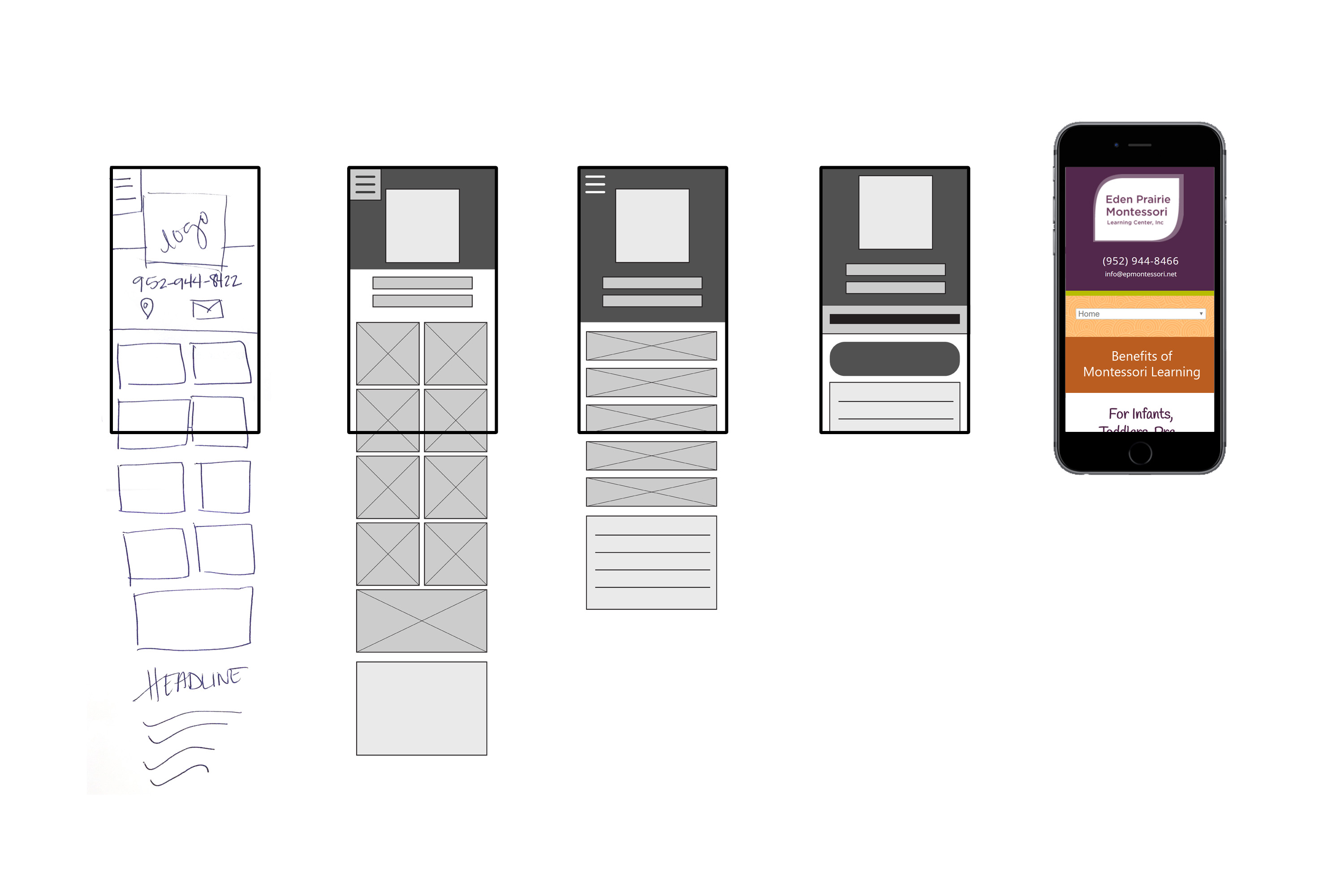
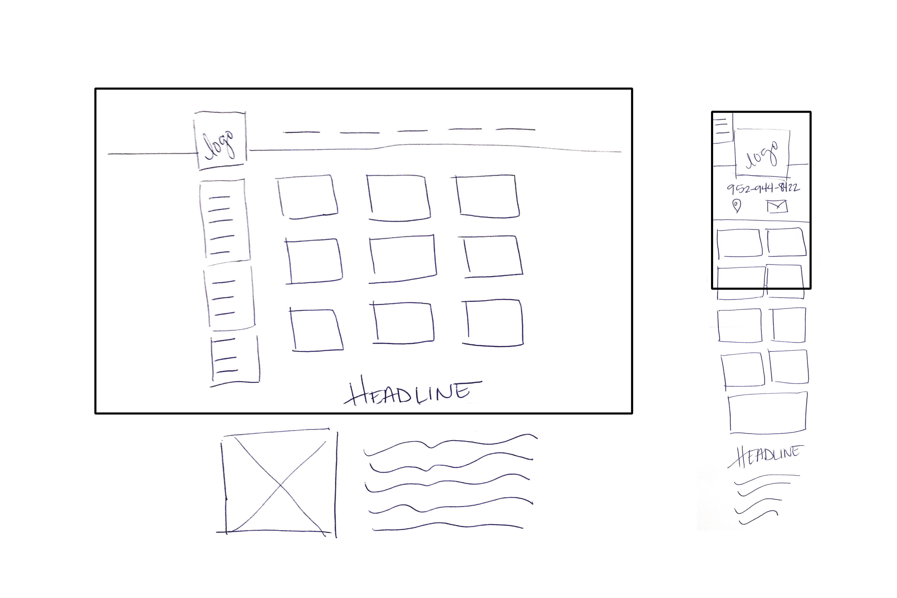
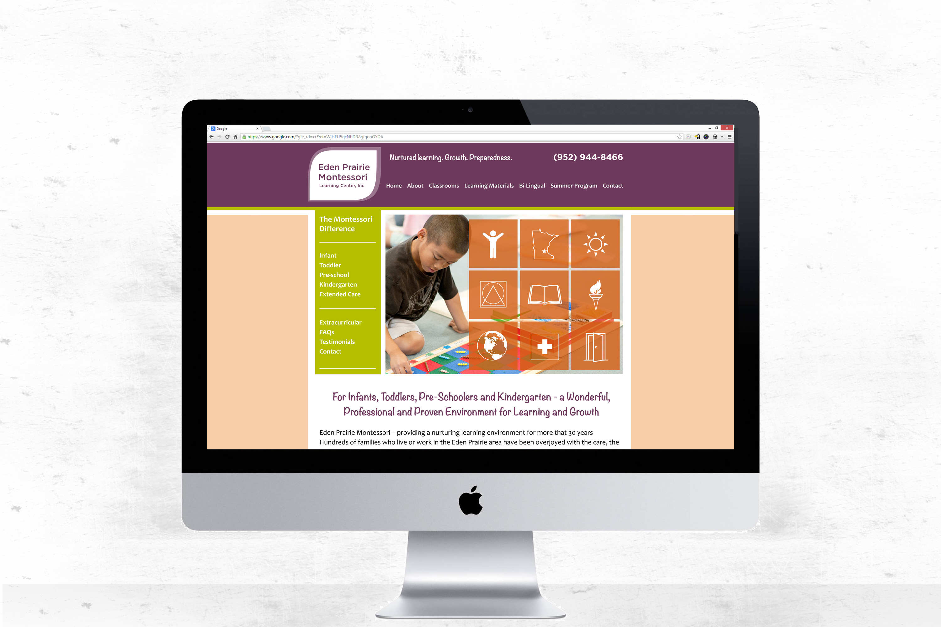
We found that the majority of their site visits came from desktop, but with a suggested digital marketing strategy focused on the social media outlets of the target audience, the mobile view would be just as significant. On desktop, the homepage focal point is a grid of icons which, when hovered, describe a key benefit and link to an internal page. With this design, the new user could have some of their questions and concerns addressed right away, with the ability to read more if desired. On mobile, the user journey is organized differently. While each key benefit was detailed and optimized on it’s own page, an overview page, titled The Montessori Difference, was the primary call to action when landing on the mobile site.